

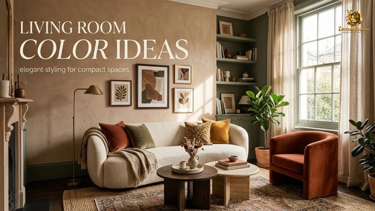
You hold forty tiny paint swatches in the store. Every one looks perfect. Then you get home, and that “soft cream” turns into baby-food yellow. Sound familiar? Choosing living room color ideas feels simple until the wall proves you wrong.
Here’s the good news. Color works by rules, and you can learn them fast. This guide gives you 25+ palettes, real pairing formulas, and the mistakes that cost people a weekend and a second gallon. Read on, and you’ll pick a shade with confidence.
How to Choose the Best Living Room Color Scheme
Start with light, not color. The same paint looks like three different shades across a single day.
North-facing rooms get cool, bluish light. Warm tones fix that. South-facing rooms get golden light, so cooler shades keep things balanced. East rooms glow in the morning and go flat by evening. West rooms do the opposite.
Next, check undertones. Every neutral leans warm, cool, or somewhere between. Hold your swatch next to white paper and the lean becomes obvious.
Then run the 24-hour test. Paint a large sample on two walls. Look at it at 8 a.m., noon, and 9 p.m. with your lamps on.
Here’s the surprise most guides skip. Your light bulbs change your paint. Warm bulbs push walls toward yellow. Cool bulbs push them toward gray. Pick bulbs first, then paint.
Finally, use the classic 60-30-10 formula for living room color combinations.
| Share of Room | Role | Typical Use |
| 60% | Dominant color | Walls, large rug, sofa |
| 30% | Secondary color | Curtains, armchairs, accent wall |
| 10% | Accent color | Pillows, art, vases, throws |
Note: Figures are a design guideline, not a strict rule. Bend them freely.
Ready for the full lineup? Let’s go.
25+ Living Room Color Ideas to Try in 2026
Think of this as your menu. Each pick gets a closer look in the sections below.
- Cream and warm white
- Soft beige
- Greige
- Taupe
- Light gray
- Charcoal
- Terracotta
- Rust
- Mustard and ochre
- Sage green
- Olive green
- Forest green
- Navy
- Dusty blue
- Powder blue
- Teal
- Plum
- Deep aubergine
- Chocolate brown
- Camel and caramel
- Blush pink
- Black accent wall
- White with natural wood
- Navy and white
- Sage and cream
- Charcoal and warm gray
- Terracotta and cream
Trends matter, but they shouldn’t boss you around. According to Pantone (2026), Cloud Dancer is the Color of the Year, a soft and airy white. According to Benjamin Moore (2026), Silhouette takes that title, a deep and rich shade. According to Sherwin-Williams (2026), Universal Khaki leads, a warm and flexible neutral.
Notice the pattern? Calm whites, deep darks, and earthy middles. That’s the mood behind most trendy living room colors this year.
Warm Living Room Color Ideas for a Cozy Feel
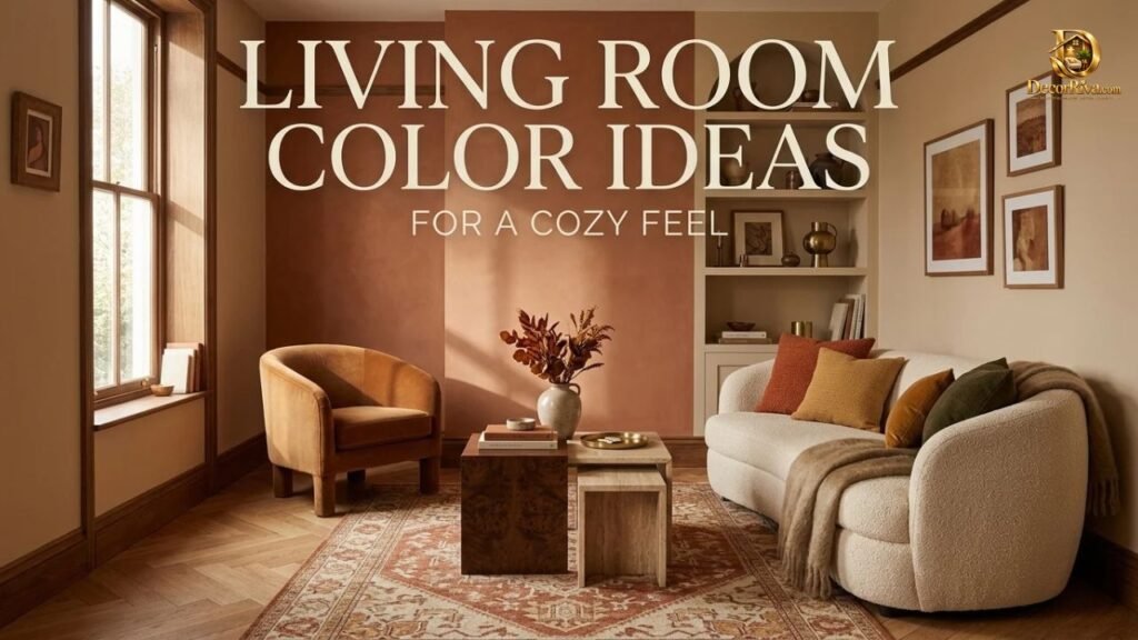
Warm colors hug a room. Think sunset, toast, and candlelight. They make big spaces feel intimate and tired spaces feel alive.
The secret is restraint. Warm living room colors work best when they sit on walls while furniture stays simple. Too many warm tones at once can feel like a heat wave.
Pair warm walls with natural textures. Linen, jute, wool, and aged wood all add depth without clutter. Add a few black metal accents to keep it modern.
Want a room that feels like a deep breath? Start with the softest warm family below.
Cream, Beige, and Warm White
Cream is the comfortable sweater of paint colors. It’s kind to every face and every piece of furniture.
Beige got a bad reputation in the 2000s, and it deserved some of it. Flat, yellow beige looked dated. Today’s beige carries a soft pink or gray undertone, so it looks calm instead of boring.
A cream living room shines with layered whites. Use warm white trim, an ivory sofa, and an oatmeal rug. The room stays bright but never cold.
Try a beige living room if you want a quiet backdrop for art and plants. Add one deep accent, like chocolate or forest green, so the space has a spine.
Terracotta, Rust, and Earthy Tones
Terracotta brings the feeling of a Mediterranean courtyard indoors. It’s brave, but it’s also friendly.
A terracotta living room works best on one wall or in a smaller room. Let the color wrap you. Pair it with cream curtains and a woven rug.
Rust sits slightly deeper and browner. It loves leather, brass, and walnut. Together they create a vintage library mood.
Earth tone living room palettes also welcome olive, sand, and clay. These shades come from nature, so they rarely clash. Pick two, add one neutral, and you’re done.
Modern Living Room Color Ideas for a Fresh Look
Modern doesn’t mean cold. It means clean, intentional, and edited.
Modern living room colors usually follow a short formula: two neutrals plus one accent. Think white walls, a gray sofa, and one saturated pillow. The accent does all the talking.
Minimalist living room colors lean on contrast instead of clutter. A matte black window frame against a white wall feels crisp. A pale gray ceiling over white walls adds quiet depth.
Another fresh option is a monochrome room. Use one color in three shades: light on walls, medium on furniture, dark on accessories. It looks designed, even on a small budget.
Add texture to keep modern from turning flat. Bouclé, ribbed glass, and matte ceramics do that job well.
Neutral Living Room Color Ideas That Never Go Out of Style
Neutrals earn their reputation. They flex with your furniture, your seasons, and your changing taste.
Neutral living room colors also help resale. Buyers picture their own lives in a calm space. That’s practical, not boring.
The trick is layering. Combine three neutrals with different textures and depths. A flat room needs contrast, not more beige.
Want specifics? Two combinations dominate below.
Soft Gray, Greige, and Taupe
Gray has grown up. Cold, bluish gray faded out, and warmer versions took over.
Greige blends gray and beige, so it solves the undertone problem. It works with cool and warm furniture alike. That’s why designers reach for it so often.
Taupe leans brown with a gray whisper. It feels richer than greige and more sophisticated than beige. A taupe living room looks calm at night and warm at noon.
A gray living room pairs well with brass lamps and cream bedding-style throws. Those warm touches stop gray from feeling like an office.
White and Natural Wood Combinations
White walls with natural wood is the Scandinavian classic. It’s bright, honest, and hard to ruin.
A white living room loves oak, ash, and walnut. Light woods feel airy. Dark woods add grounding contrast.
Choose your white carefully. Pure white can feel sterile. A white with a drop of yellow or gray feels softer.
Finish with greenery. A fiddle-leaf fig or trailing pothos makes the whole palette feel alive.
Bold Living Room Color Ideas for a Dramatic Look
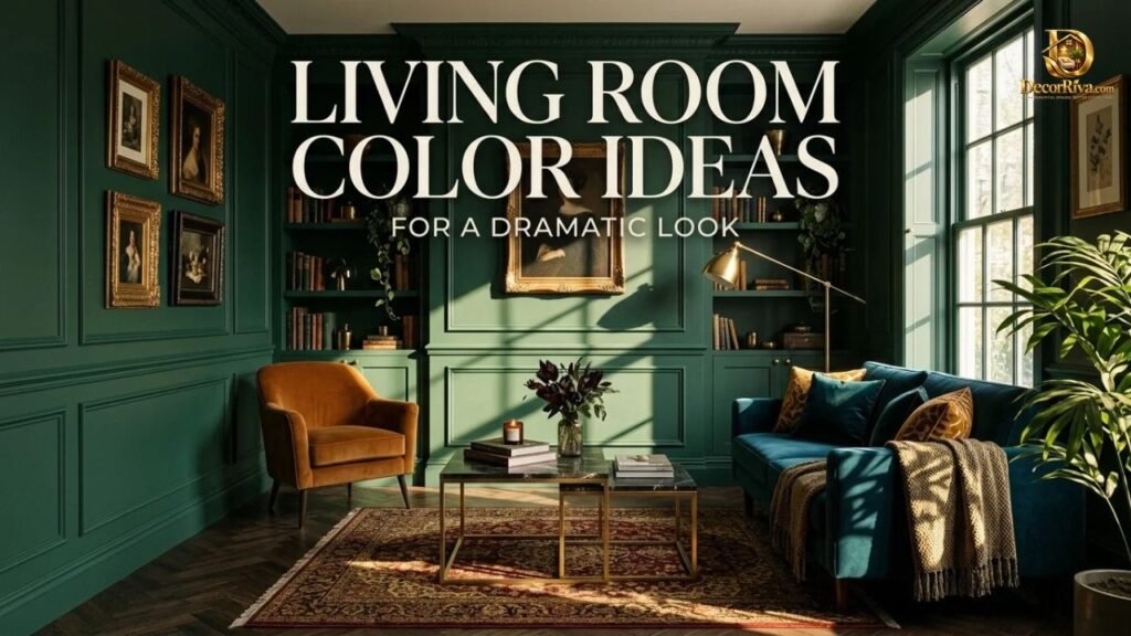
Bold paint is a confidence move. You walk in, and the room has an opinion.
The fear is real. What if it’s too much? Here’s a fix: go bold on one surface only. A single saturated wall, a painted fireplace, or a deep ceiling gives drama without overload.
Cobalt blue, emerald, and mustard make strong statements. Balance them with white trim and plenty of natural light.
Keep furniture simple in a bold room. Let the color perform. Add one pattern at most, like a striped rug.
Bold works best when you commit. Half-hearted color looks like a mistake. Full commitment looks like a plan.
Moody Living Room Colors for a Cozy and Elegant Space
Dark colors feel counterintuitive. Aren’t they supposed to shrink a room? Not always.
Deep shades blur corners and edges, which can make walls seem to disappear. In evening light, a dark living room feels like a cocoon. These are elegant living room colors with serious personality.
Charcoal, ink blue, deep brown, and near-black green lead the moody group. A charcoal living room looks gallery-ready with white art frames. Chocolate brown feels like a cigar lounge in the best way.
Use matte or eggshell finish. Glossy dark paint shows every wall flaw. Matte hides them.
Layer warm lighting. Table lamps, sconces, and candles matter more here than in any other color family.
Some people love a dark living room color for movie nights. You might, too.
Green Living Room Color Ideas for a Natural Feel
Green is the great peacemaker. It sits in the middle of the color wheel, so it relaxes the eye.
Sage green is the crowd favorite. It’s soft, gray-leaning, and friendly with wood and cream. A sage green living room feels like a spa that happens to have a sofa.
Olive green adds warmth and a little vintage charm. An olive green living room pairs well with brass, rattan, and leather.
Forest green goes deeper and moodier. Use it on cabinetry or one wall, then balance with ivory.
Green also connects indoor and outdoor space. If your window faces trees, match one shade to the leaves. The room will feel bigger because the view becomes part of the palette.
Blue Living Room Color Ideas for a Calm Atmosphere
Blue lowers the pulse. That’s why it dominates bedrooms and spas. It does the same in living rooms.
Powder blue feels airy and nostalgic. Dusty blue looks more grown-up, with a gray touch. Both are calming living room colors that suit morning light.
Navy brings weight and polish. A navy living room looks tailored, especially with white trim and camel leather. It’s a classic for a reason.
Teal sits between blue and green and adds some energy. Use it on an accent wall or velvet chair.
Careful with cool blues in north-facing rooms. They can feel chilly. Add warm wood, cream textiles, and amber bulbs to keep balance.
Want to see how cool colors behave? Cool living room colors need warm helpers. Always pair them with at least one cozy material.
Plum and Deep Purple Living Room Ideas for 2026
Purple is making a quiet comeback. Not the bright grape kind. The smoky, earthy kind.
Plum reads as a neutral for people who love jewel tones. It feels rich without shouting. Deep aubergine looks almost brown in low light and wine-colored in daylight.
A plum living room pairs beautifully with gold, cream, and soft green. Think velvet sofa, brass lamp, and linen curtains.
Try plum in a smaller dose first. Paint a bookcase, a door, or a single wall. Live with it for a week.
Purple surprises people. Guests usually ask, “What color is that?” Then they ask for the name.
Two-Color Living Room Ideas for a Balanced Look
Two colors keep things simple. They also keep rooms calm, because your eye knows where to rest.
The easiest living room color combinations pair one light and one deep shade. Here are tested pairings you can copy.
| Pairing | Mood | Best For |
| Navy and white | Crisp, classic | Most living rooms |
| Sage and cream | Soft, organic | Cozy spaces |
| Charcoal and warm gray | Modern, layered | Open-plan rooms |
| Terracotta and cream | Warm, earthy | Sunny rooms |
| Black and white | Graphic, bold | Contemporary homes |
Note: Pairings are style suggestions based on common design practice.
Pick one color to lead. Let the other support. A 70-30 split often feels better than 50-50.
Add a third accent only at the end. A brass lamp or green plant is plenty.
Small Living Room Color Ideas That Make the Space Feel Bigger
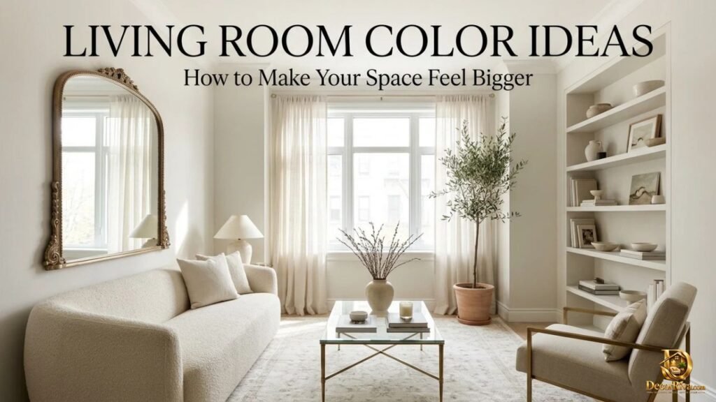
Small rooms don’t need white walls. They need smart choices.
Light colors reflect light, which opens a space. Soft white, pale greige, and light sage all work as small living room color ideas. Paint the trim and walls in the same shade to remove visual breaks.
Light reflectance value, or LRV, helps you compare paint. A higher number means more bounce.
| Paint Type | Typical LRV Range | Effect in Small Rooms |
| Bright whites | 80 to 95 | Very open and airy |
| Light neutrals | 60 to 80 | Soft and spacious |
| Mid-tones | 30 to 60 | Cozy, needs good light |
| Deep colors | Under 30 | Moody, wraps the room |
Note: Figures are estimates and may vary by brand and finish.
Here’s a twist. Paint the ceiling a shade lighter than the walls. The room will feel taller.
What about large living room color ideas? Big rooms handle deeper shades well. Use them to create zones, such as a darker reading corner.
Living Room Accent Wall Color Ideas
An accent wall is a spotlight. Choose the wall your eye hits first when you walk in.
Skip the wall with the television. Dark screens and dark walls blend, and the room feels heavy. Behind the sofa or fireplace usually works better.
Choose a color from something you already own. Pull a shade from your rug or artwork. The wall will feel planned, not random.
Strong accent wall colors include deep green, navy, terracotta, and black. Soft options include blush, dusty blue, and warm taupe. A black accent wall looks stunning with brass frames and a pale sofa.
Prefer drama without paint? Try limewash. It adds cloudy texture that looks expensive.
Color Ideas for Living Rooms With Dark Furniture
Dark furniture needs breathing room. Think espresso wood, black leather, or charcoal sofas.
Light walls create contrast. Warm white, soft beige, and pale sage make dark pieces look sharp instead of heavy. The furniture becomes the star.
Want something moodier? Match the walls to the furniture tone. A dark sofa against a deep green wall feels intentional and cozy.
Add lighter textiles to keep balance. Cream pillows, a light jute rug, and sheer curtains all help.
Metal accents matter here. Brass and gold warm up dark wood. Chrome and black suit modern setups.
Color Ideas for Living Rooms With Light Furniture

Light furniture gives you freedom. A white or cream sofa works with nearly any wall color.
Deep walls make pale furniture glow. Navy behind a cream sofa looks like a magazine spread. Forest green does the same.
Prefer soft? Layer tone on tone. A greige wall, an oatmeal sofa, and a taupe rug create quiet richness.
Watch for washed-out rooms. All-pale spaces can feel blank. Add one dark piece, like a black side table or framed art.
Pattern helps too. A striped rug or botanical pillow gives pale rooms personality.
How to Match Living Room Colors With Rugs, Curtains, and Furniture
Start with the biggest piece. Usually that’s the sofa or the rug. Choose paint after that, because fabric has fewer shade options than paint.
Rugs set the palette. Pull two or three colors from the rug and repeat them elsewhere. A rug with navy, cream, and rust leads to obvious pillow and curtain choices.
Curtains should disappear or contrast. For a calm look, match them to the wall. For drama, go a few shades deeper.
Match undertones across materials. A warm beige sofa fights with a cool gray wall. Hold fabrics next to your swatch in daylight.
Mix wood tones carefully. Two woods work well together if they share an undertone. Three woods need a unifying rug.
Finally, repeat each color at least twice. Repetition makes a room feel finished.
Living Room Color Mistakes to Avoid
Even good palettes fail when people skip basics. Avoid these common traps.
- Skipping the sample test and trusting a tiny chip
- Ignoring undertones, so grays turn purple and beiges turn pink
- Choosing paint before furniture
- Using too many colors, so no single one leads
- Forgetting the ceiling and trim
- Picking glossy finishes for dark walls
- Following a trend you won’t love in two years
- Overlooking light bulbs, which change every shade
The biggest mistake is rushing. Paint is cheap compared to furniture, but a repaint costs time and patience. Test twice, paint once.
Frequently Asked Questions
What is the best color for a living room?
Warm neutrals like cream, greige, and soft beige suit most rooms, lighting conditions, and furniture styles.
What living room colors are trending in 2026?
Soft whites, earthy khaki, sage green, terracotta, and deep moody shades like espresso and plum are trending.
What colors make a living room feel cozy?
Warm tones like cream, terracotta, rust, caramel, and chocolate brown create a cozy, wrapped-in-a-blanket feeling.
What colors make a small living room look bigger?
Light shades with high reflectance, like soft white, pale greige, and light sage, open small rooms visually.
What is the best two-color combination for a living room?
Navy and white is the most reliable pairing, with sage and cream a close second.
How do I choose a living room accent wall color?
Pull a shade from your rug or artwork, then test it on the wall behind your sofa.
Conclusion
The best living room color isn’t the trendiest one. It’s the one that works with your light, your furniture, and your daily life. Test samples, respect undertones, and follow the 60-30-10 rule.
Now go grab two sample pots and paint two big squares. Live with them for a day. By tomorrow night, your room will tell you which color it wants.